Shin Tokyo Rebranding
Scroll down and find out.
Guidelines
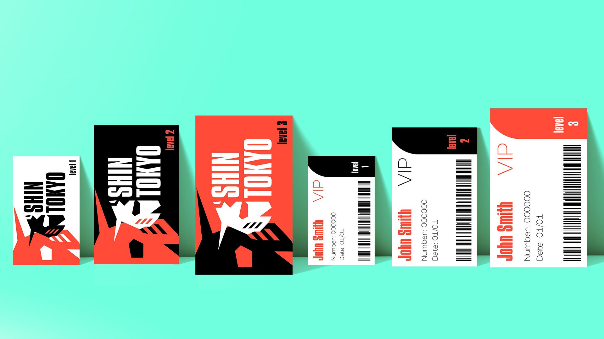
Create a new logo for the pre-existing company and redesign branding and marketing materials, including the logo, icon, business card, and two additional touchpoints.
Style/Goal
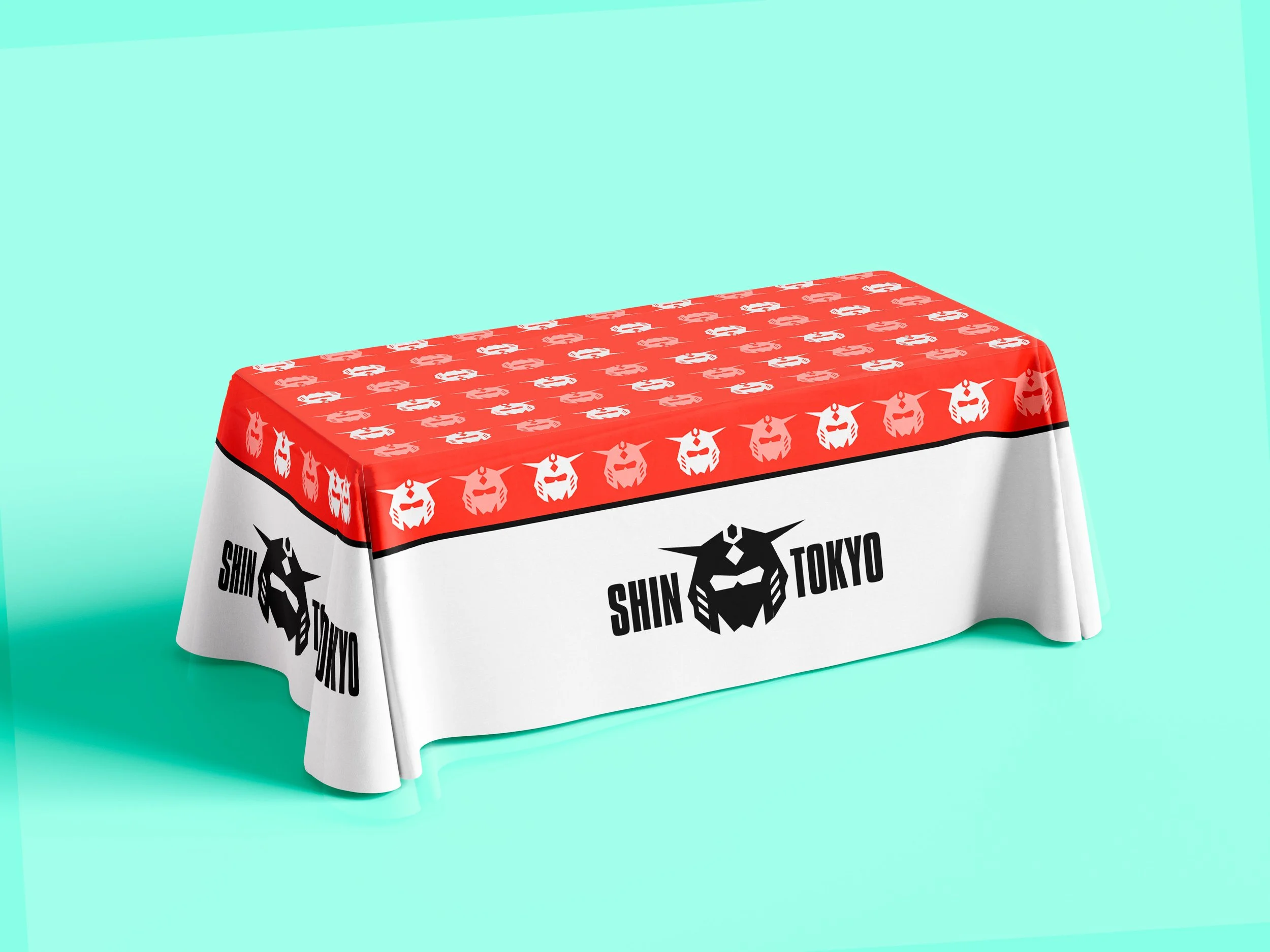
I chose to redesign the logo by simplifying the pre-existing design by refining the character’s helmet from their current marketing material and refining the overall shape to form a more robotic/samurai appearance reminiscent of Gundams and other Mecha anime designs, continuing the same orange colour associated with the company, and reusing the previous font face within the logo for marketing materials.
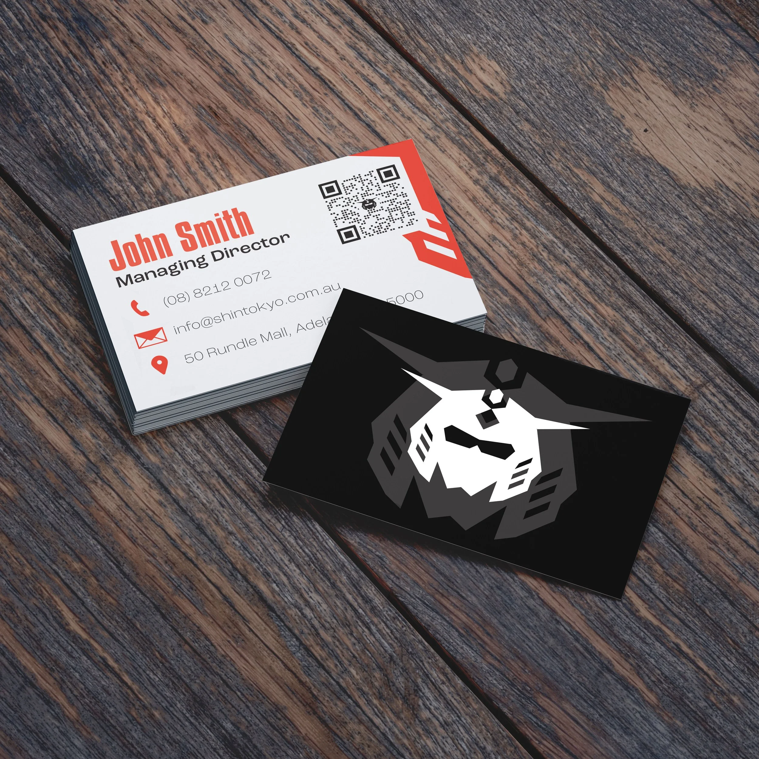
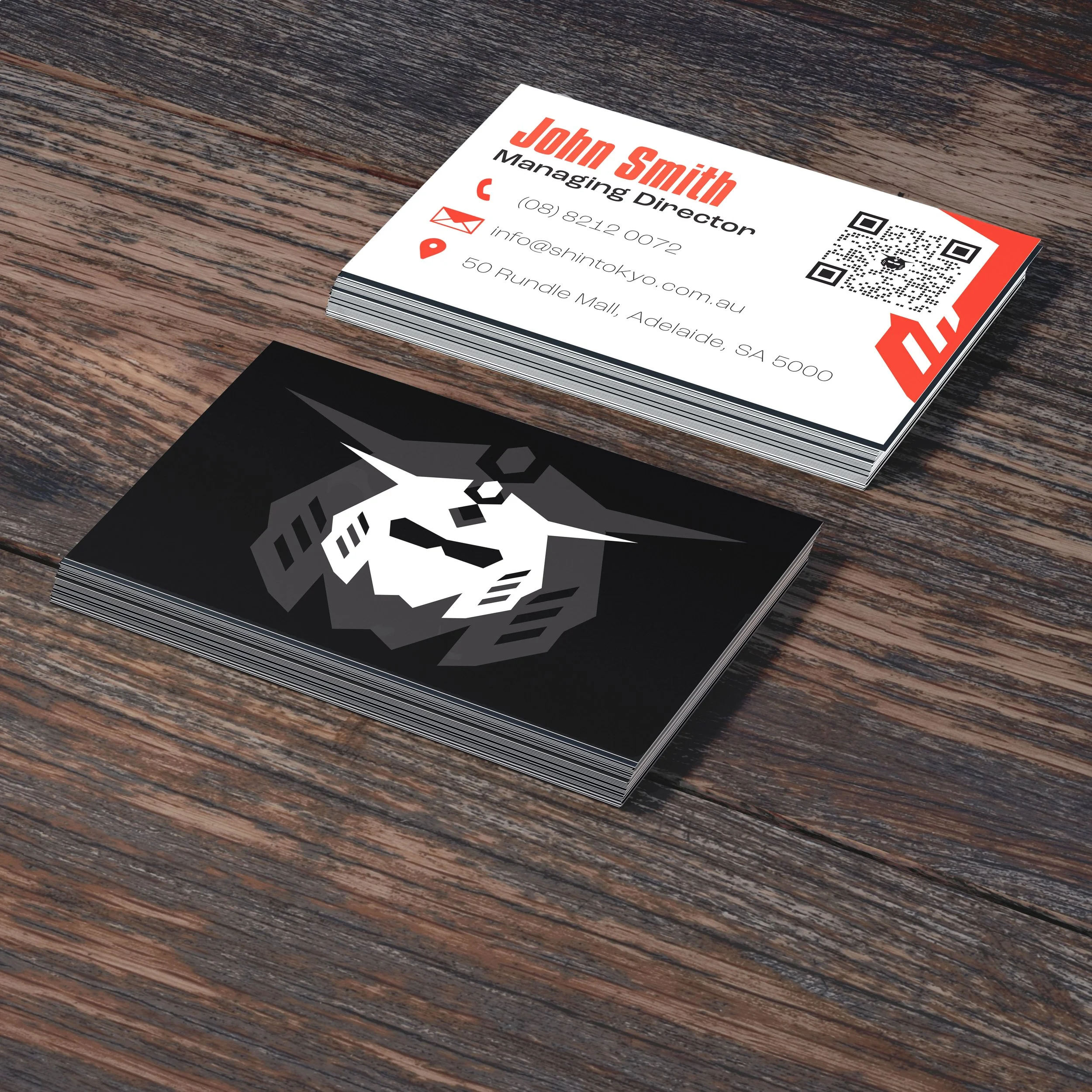
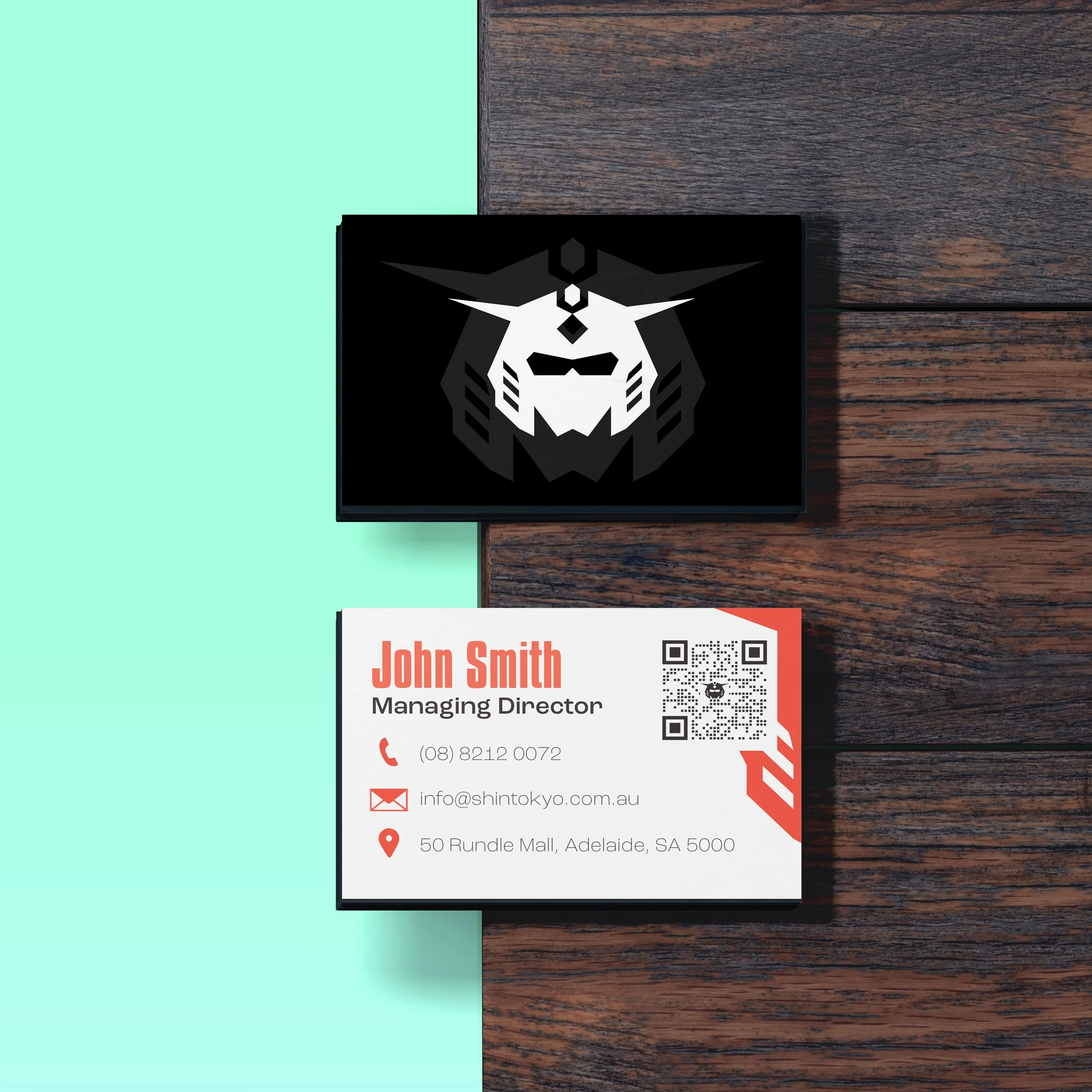
The business card heavily features the icon within the new logo design, with a contrasting tint beneath it to separate the white and black background. The info side consists of orange highlights for visual appeal and to highlight key elements within the design.